Phone showing the home page

better bouquets

An app that connects users with local florists to order pre-arranged and fully customizable bouquets for delivery or pick-up

project overview
objective
Design an app that allows users to order fully customizable and pre-arranged bouquets from local florists
roles
Research
Prototyping
User Flow
Visual Design
tools
Figma
Adobe Illustrator
Miro
Google Sheets
Google Forms
Google Meet
duration
September 2022 - December 2022
4 months

the problem

Ordering flowers can be frustrating, overwhelming, and expensive.
Bouquets and other floral arrangements are one of the most populars gifts. Nothing beats seeing the look on someone’s face when they receive a beautiful bouquet of freshly-picked flowers. However, ordering flowers is a whole other story. It can be stressful, overwhelming, and expensive. Here are the main concerns people have when deciding whether to order flowers or not.
Customizing flowers icon
can't customize or modify

Many florists only offer pre-arranged bouquets. Sometimes, these bouquets have flowers or fillers that customers are not interested in, making them feel like they are paying for something they don't want. Customers want to be able to customize their own bouquets based on their likes, budget, and other needs.

Sustainable icon
not sustainable

Many people would like to order flowers more for gifts or for themselves but know that it creates a large carbon footprint because of shipping of non-native plants, out-of-season flowers, and delivery to other parts of the country.

Expensive icon
too expensive

People like giving and receiving flowers but complain that the cost can be too great sometimes. It’s hard to find bouquets within your budget. Also, a lot of the time, extra fees are added on at the end when checking out, so users feel deceived with the prices.

Lack of knowledge icon
little to no knowledge

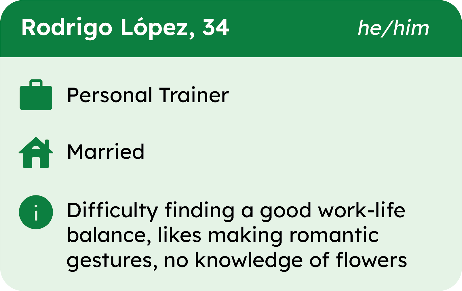
Many people express that they don't have a lot or any knowledge of how to take care of flowers, nor knowledge about what are the best flowers for them and their homes. People need more guidance when choosing floral arrangements, so they don't feel as intimidated.

how might we?

How might we design an online floral arrangement ordering platform that connects users with local florists and allows users to create a custom bouquet?
skip past solution to design process

the solution

Pink logo for Better BouquetsWord logo for Better Bouquets
Better Bouquets is a digital marketplace for ordering and customizing bouquets and other floral arrangements from local florists. The intuitive app allows users to search for local florists based on their needs. After choosing a florist, users can choose from a variety of pre-arranged bouquets made by the local florist or they can use the Customization Studio to create a unique bouquet specific to their wants and needs.
Phone mockup displaying Choosing Flowers screen of Customization Studio

key features

directory of florists

Diagram explaining the directory of florists and the different features
Diagram explaining the different elements and features of the Customization Studio screens

customization studio

This is the "sets you apart" feature of the app. This features allows users to customize their own bouquet in a guided, step-by-step process.

recommendations

The app provides users with recommendations when creating a bouquet. It gives users "perfect pairings" to help them get started, as well as recommendations for flowers and fillers based on selected choices. This will help guide any user, regardless of their flower knowledge.
Screenshot of Recommendations section on the Choose Fillers screenScreenshot of Perfect Pairings section during Choose Flowers step of Customization Studio

flower details

When building a bouquet, if users want to get more information about a specific flower or filler, they can click on the little information button below the name. An overlay will appear with information about that specific flower or filler, including prices, whether it is toxic for pets, and the different colors available.
Screenshot of overlay of flower details
GIF of live bouquet preview when creating own bouquet

live bouquet preview

While customizing a bouquet in the Customization Studio, users will get a live preview of the bouquet they are constructing. As they choose different elements to their bouquet, it will update in the preview box.
GIF showing how to access the Ordering and Customization Guides

ordering & customizing guides

Throughout the app, there are guides that help users to complete each step correctly, based on their needs. Users can scroll down to the bottom of the page or click on the "?" button, which will scroll them down to the guide.
GIF of selecting different vase options when ordering a bouquet

vase options

One part of the flower buying process is the inclusion of a vase. However, not everyone wants or needs another vase. Or perhaps, users want something more than a glass vase. The app allows users to skip a vase and get a coupon for the next purchase, as well as upgrades to a deluxe vase.
GIF showing how to access price banner

price banner

Price transparency is important to gain customer trust. The price banner can be accessed on any page the user is on. Users click on the "$" button and the price banner will appear at the bottom of the screen, outlining the prices and total.

initial research

qualitative interviews

I interviewed 6 people (ages 22-62). My target audience was people who buy flowers as gifts for others or people who buy flowers for themselves.

Theses interviews were important to find out what frustrations people have when buying flowers, what motivates them to buy flowers, and what discourages them from buying flowers.
"I wish I could create my own [bouquet] because I usually don't like the pre-made ones."
Steph, 45
"I want to shop local florists, but there isn't an easy way to browse and search for their products online."
Emily, 28
"I love buying flowers for my apartment, but the cost [of bouquets] is preventing me from buying flowers more often.
Brian, 35

interview insights

100% inside green circle
100% of participants said that money was a key factor when buying flowers
Arrow pointing down
ideas
  • Cut down on shipping costs with pick-up option
  • Filter/sort by price/budget
  • Different customization options to increase or decrease the price
83% inside green circle
83% of participants said that they had little to no knowledge about flowers and floral arrangements
Arrow pointing down
ideas
  • Recommendations based on choices/order history
  • Information about the different flowers and fillers
  • Guide for customizing a bouquet
83% inside green circle
83% of participants said that they usually buy flowers from their local grocery store or online if recipient is out-of-town
Arrow pointing down
ideas
  • Make local florists more accessible via app
  • Offer bouquet pick-up at local grocery stores
  • Work with local florists around the country
67% inside green circle
67% of participants said that they would rather support local businesses than use a big online company
Arrow pointing down
ideas
  • List local florists and their products based on location
  • Give details about local florists and their products
  • Work with local florists around the country

mapping the design

user personas & journeys

For this project, there were two user personas and journeys I needed to focus on to really understand my users.
  • A person who is buying flowers to send as a gift
  • A person who is buying flowers for themselves
I created Morgan & Rodrigo to help me better understand these specific users. I then mapped out their flower-buying journey.
Picture of Morgan, one of the user personas
Morgan
Picture of Rodrigo, a user persona
Rodrigo

user flows

I mapped out the main user flows that users would take while using my app. This helped me understand the different paths users would take to complete a specific task.
  • Choosing a florist
  • Choosing a pre-made bouquet
  • Creating a custom bouquet
  • Checking out and placing the order
The user flow shown is for creating a custom bouquet.
Diagram showing user flow for creating a custom bouquet
Creating a Custom Bouquet User Flow

starting the design

sketches

After better understanding users and their journeys, it was time to start designing the app. I started by sketching 5 iterations of the most important screens for my app. Then, I went through and starred my favorite parts from the sketches. Finally, I took all of the parts and created a new final sketch that would help guide me when creating my digital wireframes.
Picture of final sketch of the Customization Studio step screen
Final Sketch of Customization Page
Picture of 5 sketches of different versions of the Customization Studio Step screen
5 Iterations of Customization Page

wireframes

After sketching out my ideas on paper, I moved on to the next step of the UX design process: digital wireframes. From these digital wireframes, I then created a working low-fidelity prototype to test out in my first usability study.

Shown here is a wireflow of a user creating a custom bouquet using the Customization Studio.
Creating a Custom Bouquet Wireflow
Diagram of wireflow of creating a custom bouquet

testing the design

usability study #1:
lo-fi prototype

objective
Test the navigability and usability of the low-fidelity prototype
details
Participants were asked to choose a florist, create a customized bouquet, add it to the cart, and then complete the checkout out process. Participants were asked to move from task to task without going back to the home page. At the end, participants were asked to take a short survey based on a system usability scale (SUS).
participants
5 total: 3 female, 2 male
Ages: 26 - 62 years old
duration
45-60 minutes
Moderated, remote
Google Meet

usability study insights

Participants were confused about how to start an order, either by picking a florist or a product first.
1
Participants had some confusion and wanted more features during the customization process.
2
Most participants had frustration or confusion during the checkout process.
3

changes made from study insights

Click through the slides below to see the changes that were made based on insights from the usability study.
A diagram showing two sets of wireframes and the changes made from the insights from the usability study
insight #1
Participants were confused about how to start an order, either by picking a florist or a product first.
changes made
Number 1 inside pink circle
To simplify the user flow, users now start with a prompt asking them to use their current location or desired zip code to start the ordering process; they are taken to the next screen of with a map and list of florists to choose from
Number 2 inside pink circle
Instead of choosing on the home page, users will choose a florist first and then decide on delivery or pick-up
Number 5 inside pink circle
Added icons for quick visual reference for users looking for specific features or services
Number 4 inside pink circle
When users click on "See More," they will learn more in-depth details about a specific florist and this is how they will start the actual order
Number 5 inside pink circle
Added a "Change" button so users can change their location or zip code
A diagram showing two sets of wireframes and the changes made from the insights from the usability study
insight #2
Participants had some confusion and wanted more features during the customization process.
changes made
Number 1 inside pink circle
Users can now select more than one flower for their bouquet
Number 2 inside pink circle
Added an "information" button underneath each flower, filler, and add-on so users can get more information about that specific product
Number 3 inside pink circle
Included information about how many flower choices users can choose based on their bouquet size
Number 4 inside pink circle
Users can now skip adding an add-on; it is not longer required to continue the process
Number 5 inside pink circle
The price banner now includes a step-by-step breakdown of the bouquet, instead of just the total
A diagram showing two sets of wireframes and the changes made from the insights from the usability study
insight #3
Most participants had frustration or confusion during the checkout process.
changes made
Number 1 inside pink circle
Instead of a text input field, now users have a date picker and buttons to choose the pick-up window, to make selecting a date & time simpler for users
Number 2 inside pink circle
Eliminated "preferred payment" because users did not understand it
Number 3 inside pink circle
Improved the price banner to include a breakdown of the total so users understand why the total may have increased
Number 4 inside pink circle
Included more payment options such as ApplePay and PayPal
Number 5 inside pink circle
Added an "Order Preview" page that users can review before confirming and placing their order

refining the design

mockups

After making changes to my low-fidelity prototype, it was time to start building the mockups and high-fidelity prototype. I first decided on the color palette and typography, then I created the logo. Once I had the these main elements, I started to design the mockups using my wireframes.

Shown here is a screenflow of a user creating a custom bouquet using the Customization Studio.
Creating a Custom Bouquet Screenflow
Diagram of screenflow of creating a custom bouquetIcons by Icons8

testing the design
(again)

usability study #2:
hi-fi prototype

objective
Test the main user flow, navigability, and usability of the high-fidelity prototoype
details
I used the same participants as the first usability study. Participants were asked to choose a florist, create a customized bouquet, add it to the cart, and then complete the checkout out process. Participants were asked to move from task to task without going back to the home page. At the end, participants were asked to take a short survey based on a system usability scale (SUS).
participants
5 total: 3 female, 2 male
Ages: 26 - 62 years old
duration
45-60 minutes
Moderated, remote
Google Meet

usability study insights

Participants liked the progress bar and step icons but were unaware that they were also navigational buttons.
1
The guide was helpful to the participants who found it, but it was not easy to find for the rest of the participants.
2
Most participants did not use or notice the button that opens price banner at the bottom of the screen.
3

changes made from study insights

Click through the slides below to see the changes that were made based on insights from the usability study.
A diagram showing two sets of mockups and the changes made from the insights from the usability study
insight #1
Participants liked the progress bar and step icons but were unaware that they were also navigational buttons.
changes made
Number 1 inside pink circle
Added drop shadows to the icons to alert users that they are buttons
Number 2 inside pink circle
The current step icon is larger than the others to make it more obvious and to bring more attention to the progress bar
A diagram showing two sets of mockups and the changes made from the insights from the usability study
insight #2
The guide was helpful to the participants who found it, but it was not easy to find for the rest of the participants.
changes made
Number 1 inside pink circle
Added a "Help" button at the top of the screen that, when clicked on, scrolls users down to the guide
Number 2 inside pink circle
Added a "Back to Top" button that scrolls users to the top of the screen so users don't have to
A diagram showing two mockups and the changes made from the insights from the usability study
insight #3
Most participants did not use or notice the button that opens price banner at the bottom of the screen.
changes made
Number 1 inside pink circle
Changed the icon to something more recognizable like a dollar sign, added a drop shadow to make it appear more as a button, and gave it a fixed position so users can access it at any point
Number 2 inside pink circle
The price banner slides in from the bottom and slides out when the user clicks anywhere else on the screen; changed it to "subtotal" so users understand taxes are not included yet

high-fidelity
prototype

view high-fidelity prototype

reflection

what i learned

the ux design process
This was my first project that I completed while taking the Google UX Design Professional Certificate. During this project, I learned the entire design process, from start to finish. While learning the process, I also realized that the process is not linear; steps may be repeated, may be skipped, or may go out of order. The process depends on what the design needs are. This project also made me realize how much I loved designing and made me feel excited about my career change.
figma
I learned the in's and out's of Figma, an industry standard. I learned how to use the basic tools and features of Figma. I learned how to create pages so I could keep track of different versions of my design. I also learned about how to add different effects to elements, such as drop shadows. I also created very basic components that I could use over and over again, instead of having to change it on every screen it was used on.
the importance of research
As a creative person, I thought my ideas and designs would be perfect and there would be no problems that users faced. I was quickly humbled during my first usability study. Users thought about things that I hadn't even thought of. That's when I realized how important user research was. I was just one person. I needed the opinions and feedback of many different people. I needed to understand my users, and the only way to do that was through research. I also found the research part of the process really satisfying and helpful to my designs. It gave me ideas that I would have never thought about without doing research.

next steps

contact local florists
Contact different florists around the country to be a part of the app's network and customization studio feature
create photo archive
Hire professional photographers and take photos of all the flowers, fillers, and other products that can be used for the live preview in the customization studio
design other parts of the app
Finish designing the other parts of the app such as the account pages, rewards program, flower subscription service, and flower care tips & tricks

final thoughts

This was my first project since transitioning into this new career field of UX design. I was completely captivated by the entire UX process. I loved playing every part: the designer, the researcher, the analyzer, the empathizer, the problem solver. Working through every step of the process made me more and more excited about the endless possibilities I could have working in the UX industry. I remember looking at my final project, after having learned so much over the months, and thinking to myself, "I think I could make this even better now, knowing what I know now." UX gets me excited about all of the ways I can change the world through technology. This project made me feel like this was the right career change for me, and I am eager to develop my skills and become a force to be reckoned with in the industry.