A mobile mockup of the home page of the app, Citizen Connect

citizen connect

A citizen engagement app and responsive website that empowers ordinary citizens to get involved with their local government by providing them with the necessary resources and information in an intuitive and efficient way

project overview
objective
Design an intuitive and accessible app and accompanying responsive website that can be used by any user to help them connect and engage with their local government
roles
Research
Information Architecture
Prototyping
User Flow
Visual Design
tools
Figma
Adobe Illustrator
Miro
Optimal Workshop
Google Forms
Mockup
duration
March 2023 - June 2023
4 months

the problem

Getting involved in local government can be difficult, confusing, and frustrating.
Young people (18-35) are especially frustrated with the current state of the country and want to invoke change in government. Young people know that their voice can be powerful and can create the change they are seeking. However, many do not participate regularly in their local governments due to hesitations, frustrations, and fears that they have. Research led to the following being the most-voiced reasons for why they are not involved in their local governments more or at all.
time icon
lack of time and energy

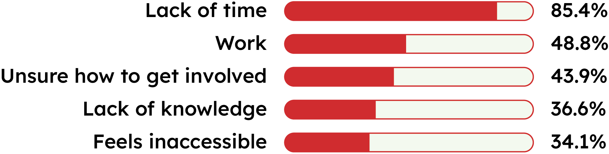
Whether they are studying, working, or building their adult lives, young people have to navigate busy schedules and often experience time famine. Many want to be more involved but feel like they can't because they don't have the time or energy.

knowledge icon
lack of knowledge

Many young people feel like they do not have enough knowledge about their local government and how it functions to know how to get involved and efficiently and purposefully voice their opinions.

social icon
no social connection

Building and maintaining relationships is an important aspect of young people's lives. Many want to get involved in their local government's but don't have friends or people they know who are involved nor have a platform where they can meet and connect with those are already involved.

search for information icon
can't find information

Most government websites are cumbersome and hard-to-navigate, making it nearly impossible to find the information a person is searching for. There is no specific part of the website that gives all of the important information that citizens need to get involved in their government.

how might we?

How might we encourage young people to get involved in their local government by resolving their hesitations and limitations?
skip past solution to design process

the solution

A photo depicting four different-sized devices: on the left, a mobile device depicts the screen of the calendar feature; to the right, a another mobile device depicts the logo; behind the mobile devices in the center, is a laptop that shows the screen to contact government officials; to the right, a tablet screen shows the screen for "My Action List"
Logo for Citizen ConnectWord Logo: Top Line: Citizen Connect 
Bottom Line: Empower. Engage. Involve.
Citizen Connect is an all-in-one, multi-device platform designed to empower and encourage all citizens to get involved in their local government. The platform brings all of the necessary and important information and resources together into one place for easy access. It also includes a social media aspect to create a community among citizens, as well as an educational aspect to build confidence and knowledge in citizens.

key features

Phone gif of opening menu on home page

easy & intuitive navigation

  • Information architecture based on user research
  • Users can access navigation menu from any screen
  • Users can access navigation menu from any screen
  • Each section has a different color to help distinguish
Phone gif of scrolling down on Profile screen

personalization & customization features

  • Create a user profile
  • Earn badges based on completing certain tasks
  • Create reminders for events, tasks, and more
  • Create personalized action list, calendar, and more

many different ways to get involved

Citizen Connect has a variety of different ways for citizens to engage with their local government. The different ways are divided into 5 categories: Act, Connect, Events, Learn, and News.

Click through the slides below to see some examples.
Mobile screen of "My Action List"
"Act" section icon: a checkmark in a box

act

Variety of different actions users can take to get involved with their local government
  • Contact Officials
  • My Action List
  • Find New Actions
  • My Elections
My Action List
Create a personalized to-do list of actions to help you stay on top of things
Mobile screen of "Community Forum"
"Connect" section icon: a group of 3 people

connect

Different ways to connect and engage with other citizens in the city
  • Bulletin Board
  • Community Forum
  • Community Polls
Community Forum
An online place to engage in civil discourse with other citizens in your city
Mobile screen of "My Calendar"
"Events" section icon: a calendar

events

Different ways to connect and engage with other citizens in the city
  • City Calendar
  • Community Calendar
  • My Calendar
My Calendar
Add events to your personal calendar and set reminders so you never miss an event
Mobile screen of "Mini-Lessons"
"Learn" section icon: a person holding a book

learn

Resources to grow your knowledge about local government
  • About My Government
  • Boards & Commissions
  • Glossary
  • Mini-Lessons
  • Officials & Departments
Mini-Lessons
Short videos and optional quizzes to encourage you to learn about how local government works
Mobile screen of "Election Results"
"News" section icon: newspaper

news

Stay up-to-date and read about what is happening in your local government
  • All News
  • Boards & Commissions
  • City Council
  • Elections
  • My News
Elections
Get results from past elections and information for upcoming elections

initial research

qualitative interviews

I interviewed 5 young people (ages 18-35) with varying educational backgrounds and gender to better understand why they did or did not participate in their local government, and what might motivate them to want to participate more.
"Two weeks ago, I went to the state capitol and spoke with legislators about an important issues to me, and it was an amazing experience. However, I only knew about it because someone else forwarded the information to me. I think if I knew more about events like this, I would get more involved. It helps to advocate alongside others."
Jordan, 32
"I think having a clear and easy way to get involved is the most important when trying to get more people involved. Many times, people feel overwhelmed and unsure of what to do, so making it as easy as possible will help. "
James, 25
"Every local government website I’ve ever used has virtually no real information, and the interface is horrible and really circular. Somehow pages always redirect to the same, uninformative page. I wish there was something better that made it easier and more efficient to get the information I needed."
Shannon, 19

survey results

To get more data that was inclusive of more people, I created a survey to identify the motivations and reasons why young people do or do not participate in their local government, as well as questions about their knowledge and attitude towards their local government.

Below are some key results from the survey.
Survey Type
Google Form
# of Questions
18 total, mix of multiple choice, multiple selection, scale, and short response questions
# of Participants
41 total
Ages
18 - 35
Gender Identity
30 women, 9 men, 2 nonbinary
Education Level
High school diploma - Doctorate degree
1
I understand how my local government works and runs.
A data table showing the percentage of participant who choose each response: 1) Yes, definitely - 9.8%; 2) I have a pretty good idea - 29.3%; 3) I have some idea - 41.5%; 4) Eh, not really - 12.2%; 5) Nope, not a clue - 7.3%
2
I know what my city's budget is and how it spend its money.
A data table showing the percentage of participant who choose each response: 1) Yes, definitely - 2.4%; 2) I have a pretty good idea - 2.4%; 3) I have some idea - 36.6%; 4) Eh, not really - 29.3%; 5) Nope, not a clue - 29.3%
3
What are some reasons that keep you from being more involved in your local government?*
A data table showing the percentage of participant who choose each response: 1) Lack of time - 85.4%; 2) Work - 48.8%; 3) Unsure how to get involved - 43.9%; 4) Lack of knowledge - 36.6%; 5) Feels inaccessible - 34.1%
* Participants were able to choose multiple answers. The top 5 reasons are shown above.
4
When searching for information, what's your preferred device?
A data table showing the percentage of participant who choose each response: 1) Phone - 73.2%; 2) Tablet - 2.4%; 3) Laptop - 22.0%; 4) Desktop - 2.4%

interview & survey insights

Young people want to get involved but don't know where to find the information they need to do so.
1
Young people are more likely to be motivated to get involved when they know friends and other people who are involved.
2
Most young people lack basic knowledge about their local government, how it functions, and who is in charge.
3
The main reasons why people don't get involved with their government are lack of time or too busy with work.
4

competitive audit

I conducted a competitive audit to see what websites or apps are out there that share information with users about their local government, but also provide them with tools and features that allow users to act on that information in an effective way. To my surprise, there were a limited number of apps and websites that focused on government involvement. I decided to also take a look at local governments' official websites to see what could be improved.
Table depicting what features competitors' websites and apps have and do not have

opportunity areas

intuitive navigation
Users find the information they need as quick and easy as possible.
easy to contact officials
Users can easily find contact information for whichever official they need to communicate with.
badges for involvement
Users are encouraged to stay involved by earning badges for specific achievements.
online involvement
Users have ways to get involved remotely, without having to go in-person.
better user interface
Users can use the product with ease and without frustration, and see political engagement as cool.
personalization features
Users can get reminders and notifications, as well as create to-do lists and personal calendars.

mapping the design

functionality mapping

First, I began brainstorming ideas about what content users will consume and what functions users will perform. I used the following questions along with my initial research to guide my brainstorming.
  • What feature would solve the target user's problem(s)?
  • What tasks are they looking to accomplish while using the product?
  • What type of content do they need?
  • What information are they looking for?
Pink =
Content
Blue =
Function
Yellow =
Category
A photo of sticky notes; pink sticky notes represented the content for the app and blue sticky notes represented the functions for the app
before sorting
I wrote out all of the content and functions I wanted to include in my product.
A photo of the same pink and blue sticky notes but sorted into different categories which would eventually become the section titles for the app
after sorting
I wrote out all of the content and functions I wanted to include in my product.

card sorting

I knew organizing my content and functions was an important step because users had complained about the difficult interfaces of their current governments' websites.

I conducted a remote card sorting study to help organize all of the information into five categories. I conducted two parts to the study: 1) deciding the titles of each category; and 2) deciding which category each content or task should be placed in.
A standardization grid using data from the card sorting study, showing what functions and features should be sorted into what categories
Based on the study, I was able to place content and tasks into the most logical category, as well as decide on the best name to describe each category. I ended up with these five categories: Act, Connect, Events, Learn, and News.
A table showing what category name was chosen by participants in the card sorting study

information architecture

After the card sorting study, I thought about how to combine content and functions to create the different pages within each category. There would be a homepage that would be personalized based on the user and then five sections that hold different content and tasks based on the topic. Additionally, there would be a profile and settings section.
A photo of the information architecture of the app

starting the design

sketches

Based on research, I knew that most of my target audience's preferred device is a mobile device. For this reason, I decided to take a progressive enhancement or mobile-first approach to designing my product.
5 digital sketches of the "Act" home screen and a final version using elements from the other 5
6 Ideations of Act Home Screen
A scan of a piece of paper showing a Crazy Eights exercise
Crazy Eights Exercise

wireframes & lo-fi prototype

Users time and time again expressed frustration with the information architecture of their local government websites so I focused on navigational features while constructing my wireframes.
A diagram of a wireframe of "My Action List" and explanations for design choicesview low-fidelity prototype

testing the design

usability study

objective
Test the navigability and usability of the low-fidelity prototype
details
Participants were asked to complete 6 tasks, each one pertaining to a different section of the app. They were asked to move from task to task without going back to the home page. At the end, participants were asked to take a short survey based on a system usability scale (SUS).
participants
5 total: 3 female, 2 male
Ages: 20 - 32 years old
duration
45 - 60 minutes
Moderated, in-person
Austin, Texas

synthesizing the data

affinity diagramming
I used affinity diagramming to help organize observations, thoughts, and behaviors of the participants. Then, from here, I synthesized the data and came up with insights to help me improve my design.

Each color sticky note represents a different participant from the study.
an affinity diagram using the data from the first usability study
A data table showing the amount of time a participant took on each task during the usability study
time on task
I looked at my data for time on task to determine which tasks took longer than anticipated. Tasks that took longer than 30 seconds to complete were priorities when making changes to my prototype.
use of back button
I wanted to know how often the back button was used by users. I had been doing research on thumb-driven design and wanted real data to decide if I should move the location of the back button to the bottom of the screen.
A data table showing how many times a user used the back button during the usability study

usability study insights

All participants had difficulty finding information about elections. They looked in "Act" or "Events," instead of "Learn."
1
Participants used the back button an average of 19 times. They also showed signs of difficulty reaching the button at the top.
2
Participants expressed that the calendar list view was more helpful than the grid view and wished it was the default.
3

refining the design

changes made from study insights

Click through the slides below to see the changes that were made based on insights from the usability study.
A diagram showing a wireframe and mockups of the same screen to show the progression and changes made from the usability study
insight #1
All participants had difficulty finding information about elections. They looked in "Act" or "Events," instead of in "Learn."
changes made
Number 1 inside 2 circle
Moved “My Elections” from the “Learn” section to the “Act” section
Number 2 inside red circle
Added a “View My Ballot” button to the event page for an election to create another way for users to find information
A diagram showing a wireframe and mockups of the same screen to show the progression and changes made from the usability study
insight #2
Participants used the back button an average of 19 times. They also showed signs of difficulty reaching the button at the top of the screen.
changes made
Number 1 inside 2 circle
Moved the back button to the bottom left corner of the screen
Number 2 inside red circle
Redesigned the bottom navigation bar to include a menu overlay to open when the menu button is pressed
A diagram showing a wireframe and mockups of the same screen to show the progression and changes made from the usability study
insight #3
Participants expressed that the calendar list view was more helpful than the grid view and wished it was the default.
changes made
Number 1 inside 2 circle
“List View” is now the default when users click on a specific calendar
Number 2 inside red circle
Changed the drop down in the heading a switch, so users can toggle between the three calendars easily
Number 3 inside red circle
Added labels to the switches so users know the purpose of each switch

thinking about accessibility

color contrast
All color combinations were checked to make sure the contrast ratio met the Web Content Accessibility Guidelines (WCAG) Level AA or AAA.

All met WCAG Level AA, and most met or exceeded the WCAG Level AAA ratio.
A diagram showing a mockup of "My Calendar" and the color contrast ratios and if they passed WCAG AA/AAA standards
All colors were contrasted with the background color.
heading annotations
Adding heading annotations will ensure screen readers and other accessibility devices understand the content structure of each screen, helping users navigate the app with ease.
A diagram showing the heading hierarchies on a screen
accessibility settings
Including accessibility settings directly in the app will make it more accessible to more people. Users will be able to change settings that will give them the best experience as possible.
A mobile screen showing the accessibility settings

components

Click on each tab to see examples of how each component was used in my prototype.
GIF showing an interaction with the complete/incomplete buttons on the "My Action List" screen
buttons
Marking actions complete or incomplete in My Action List
GIF showing the expandable/collapsible content
collapsible content
Looking at the different races and propositions on the ballot for an election
GIF showing how a drop down menu works
drop down menus
Choosing a category while creating a new action
A screen showing an empty state when there is no user data to populate it
empty states
What appears if a user clicks on "My Action List" and has not added at least one action to it
GIF showing how a modal slides into the screen when you click on a date on the calendar
modals
Looking at events in My Calendar
GIF showing how switches turn on and off in Settings
switches
Turning notifications on or off in Settings

high-fidelity
prototype

view high-fidelity prototype

website design

why build a related website?
  • Some users don't want to download an app just to get involved with their local government.
  • Some users don't want to create an account. The website allows users to find information and use many features without an account.
  • Users search for information on a variety of devices, so it was important to design a responsive website that can work on any device.

from app to mobile website

When designing the mobile website, I wanted to make sure the mobile website mirrored the app to provide consistency across the platforms. Also, I wanted to think about the context in which users would be using the website instead of the app.

These mobile users: 1) don't have the app or an account; 2) are searching for information quickly on their phone; or 3) are exploring what Citizen Connect is.

See below for an explanation of changes made to the home page while creating the mobile website.
A diagram showing two different screens: the one on the left shows the home page of an app user; the one on the right shows the home page of a mobile website user who has not logged in or does not have an account
Number 1 inside 2 circle
I changed the top navigation bar to correspond with the tablet and desktop versions of the website. Because of minimal space, the three vertical dots acts as a small drop down menu to access other actions.
Number 2 inside red circle
When users first open the website, they will be asked to choose a city before continuing. This will make sure the correct information is given from the beginning.
Number 3 inside red circle
Instead of personalized tasks and recommendations like on the app, the home page will explain the different features users can find in each category.
Number 4 inside red circle
The bottom navigation bar still holds the back and the menu button. This menu button opens to a more traditional, full page menu with access to all pages, similar to how it would look on a tablet or desktop device.

responsive design across devices

Nowadays, people use a variety of different devices to access websites. This is why building a responsive website is essential.

See below for an explanation of design decisions across different devices.
A diagram showing three different screen sizes: mobile, tablet, and laptop and how the different elements are placed in each screen size
Number 1 inside 2 circle
header navigation bar
Number 3 inside red circle
back button
mobile - Because of limited space, I decided to show the most used icon button, the profile button, and then include a drop down menu to reveal the other two buttons, settings and notifications.
tablet & laptop - The header navigation bar is fixed to the top of the page so it is always accessible to users.
mobile - The back button is an essential and frequently-used function on a mobile device. Because of this, it is fixed at the bottom of the screen for easy access to users.
tablet & laptop - The back button accompanies the title of each page at the top of the screen. This makes it easy to locate and use.
Number 2 inside red circle
navigation menu
Number 4 inside red circle
action list
mobile - The menu button is fixed to the bottom of the screen because it will be used the most, making it easier to reach for users. When pressed, a modal navigation bar slides out from the right to show the full menu.
tablet & laptop - The header navigation bar also includes the different sections and pages within each section so users can easily access any page wherever they are on the website.
mobile - The page elements are split into two separate screens because of limited space. The first screen shows cards with the name of the action, due date, and quick actions. Users can then click on a specific card to view more details about that action on a second screen.
tablet & laptop - There is a table with two scrollable columns to allow users to quickly skim information about each action. Users simply click on an action in the first column and the information populates in the second column. There is also an option to make the details section fullscreen.

website prototypes

reflection

what i learned

auto-layout & components
During this project, I really began to understand the importance and necessity of using auto-layout and components, especially when designing for multiple devices. They make the entire process more efficient for designers and make it easier for developers to create the final product. I feel much more confident using these features now and know I will only keep improving with more and more practice.
never-ending design process
I came to the realization that designs are never really "finished." At first this was a frustrating realization to come to because I am perfectionist. However, I finally understood that it's okay if our design isn't completely perfect after our first prototype or first study. As UX designers, our job is to constantly test and iterate on our designs to make the user experience the best it can be. With continual research and feedback from users, we will always be able to improve upon our designs.
card sorting study
I learned about, planned and ran a card sorting study. I knew that I had a lot of different functions and content I wanted to include in my product so I wanted to make sure everything was organized in the most simple and intuitive way. Additionally, during the initial research, users expressed frustration with competitors because their websites were too cumbersome, confusing, and unintuitive. Running a card sorting study and analyzing the results allowed me to create the best information architecture for my product.

next steps

more usability studies
Plan and run a usability study to test all high-fidelity prototypes with users in target audience (18-35 years old)
create video content
Create videos and quizzes for the mini-lessons, making sure to include an expert on local government during the process
create remaining badges
Come up with other ideas for badges that users can earn while using the app, as well as the objectives they need to meet to earn the different levels of each badge
collect information
Work with developers to start collecting, storing, and organizing information that will be used to populate the content on the app and website

final thoughts

I really enjoyed creating a product that was designed to do social good. I felt passionate and motivated to create a product that creates a positive impact on society. This made me realize that I want to work with companies and products that create a better world or better life for users. As UX designers, we have the opportunity to enact change through technology and that is something that really excites me! Also, I felt like this was the first project that I felt confident in my skills, abilities, and knowledge. I was able to go through the design process without much thought, and I, instead, was able to focus on sharpening my skills, learning more complex features in Figma, and building on my prior knowledge. This project also felt like the most complete project I have completed, in terms of the number of screens created, the amount of research done, and the creation of responsive designs for 3 different devices.